 dan
The branding guide · 20 parts Updated October 2026 · about 40 min read
What Is Branding?
A designer's honest guide.
What branding really is, how it differs from a logo, and how I build strategy, logos, colors, fonts and voice that carry through a website, landing pages and funnels. With logos I've designed and live demos.

- 01What is branding?
- 02Brand vs logo vs identity
- 03Why branding matters
- 04Brand strategy
- 05Positioning
- 06Personality & voice
- 07Naming a business
- 08What makes a good logo
- 09Logo types
- 10Brand colors
- 11Brand fonts
- 12Photos, icons & style
- 13Brand guidelines
- 14Branding on your website
- 15Landing pages & funnels
- 16Ads & social posts
- 17Local business branding
- 18Rebranding
- 19Common mistakes
- 20DIY vs hiring a designer
On this page
- 01What is branding?
- 02Brand vs logo vs identity
- 03Why branding matters
- 04Brand strategy
- 05Positioning
- 06Personality & voice
- 07Naming a business
- 08What makes a good logo
- 09Logo types
- 10Brand colors
- 11Brand fonts
- 12Photos, icons & style
- 13Brand guidelines
- 14Branding on your website
- 15Landing pages & funnels
- 16Ads & social posts
- 17Local business branding
- 18Rebranding
- 19Common mistakes
- 20DIY vs hiring a designer
- +Glossary
- +FAQ
What is branding? The short answer
Ask ten people what branding is and eight will say "the logo". The logo matters, but it's the smallest visible piece of something much bigger.
Branding is the work of shaping how people recognise, remember and feel about your business. It covers your name, logo, colors, fonts, photos, words and tone, plus the promise you make and how consistently you keep it. Your brand is the reputation that results: what people say about you when you're not in the room.
Think of the businesses you trust without thinking. You can picture their colors. You know roughly what they'll charge, how they'll talk to you and what you'll get. None of that is an accident. Someone decided it, wrote it down and repeated it everywhere until it stuck.
For the small businesses I build websites and funnels for, branding has a very practical job: make the business look as good as it actually is, make it easy to pick out from competitors, and make every page, ad and invoice feel like it came from the same place.
Brand vs branding vs logo vs brand identity
These words get mixed up constantly, including by designers. Here's how I separate them when I talk to clients.
| Term | What it means | Example |
|---|---|---|
| Brand | The overall perception people hold about your business | "They're the reliable, no-nonsense plumber" |
| Branding | The actions you take to shape that perception | Choosing a voice, designing a logo, writing a promise |
| Brand identity | The visible and verbal toolkit | Logo, colors, fonts, photo style, tone of voice |
| Logo | The symbol or wordmark that signs your work | The mark on your van, site header and invoices |
| Brand guidelines | The rulebook for using the identity | A PDF or page with do's and don'ts |
You can own a beautiful logo and still have a weak brand if the service, website and messages contradict it. And you can have a simple logo and a very strong brand because everything around it is clear and consistent.
Why branding matters for small businesses
Big companies spend fortunes on branding. Small businesses often think it's a luxury. I think it's the opposite: small businesses need it more, because they can't outspend anyone.
- Recognition: people remember and pick you out of a search page, a feed or a street.
- Trust: a consistent, professional look signals that the business is real and organised.
- Price: a clear brand makes it easier to charge what you're worth instead of competing on cheapest.
- Focus: it tells your ideal customers "this is for you" and quietly filters everyone else.
- Speed: every new page, ad or flyer is faster to make when the rules already exist.
Online, first impressions happen in seconds. A visitor lands on your website from Google or an ad and judges, almost instantly, whether you look credible. Branding is a big part of that snap judgment, before they've read a single sentence.
Brand strategy: purpose, audience and promise
Before any design, I need three answers. If these are fuzzy, no logo can fix it.
- Purpose: why does the business exist, beyond making money? One honest sentence.
- Audience: who exactly is the best customer? Age, situation, what they're worried about, where they find you.
- Promise: what do you reliably deliver that they care about? Fast, careful, premium, friendly, local?
I also ask for proof of the promise. If you say "fast", what's your actual response time? If you say "premium", what makes it premium? A brand promise you can't keep is worse than none, because the first bad experience breaks it publicly.
My simple brand strategy sentence
"We help [audience] get [result] by [how you do it differently], so they feel [emotion]." Filling this in is the most valuable ten minutes of any branding project.
Positioning: how to stand out from competitors
Positioning is the space you own in a customer's mind compared to the alternatives. If you don't choose one, the market chooses "same as the others" for you.
Look at five to ten competitors, write down how they look and what they promise, then choose a position that's true for you and different from them: a specialist niche, a style, a price level, a guarantee or a personality.
When I research a local industry, I literally screenshot competitor sites side by side. Often they all use the same blue, the same stock photo of a smiling worker and the same "quality service you can trust" headline. That's the opening. Be the one that looks and sounds different, while still fitting what customers expect from the category.
| Positioning angle | What it sounds like |
|---|---|
| Specialist | "Only dental implants" or "only metal roofs" |
| Audience | "Physio for runners" or "websites for coaches" |
| Speed | "Same-day repairs" |
| Premium | "Handmade, by appointment" |
| Personality | "The plumber who actually explains things" |
Brand personality and tone of voice
Your voice is how your brand sounds in headlines, emails, captions and on the phone. It's branding people hear, not just see.
I describe voice with three adjectives plus what each one is not. For example: friendly, not silly. Confident, not arrogant. Clear, not cold. That small list keeps every writer, including future you, on track.
| Same message | Formal voice | Friendly voice |
|---|---|---|
| Booking confirmation | Your appointment has been confirmed. | You're booked in. See you Thursday! |
| Call to action | Request a consultation | Let's talk about your project |
| Price note | Pricing available upon request | Here's roughly what it costs |
Naming a business: the basics
Names are hard, and they're the hardest thing to change later. A few checks save a lot of pain.
- Easy to say and spell after hearing it once
- Available as a domain (or a close, clean variation)
- Available on the social platforms you'll use
- Not too close to a competitor or a known brand
- Leaves room to grow: avoid locking into one town or one product unless that's the point
- Checked with your local business registry and, for bigger plans, a trademark search
Descriptive names ("Fold & Fresh Laundry") are easy to understand and help a little with local search. Invented names ("Tasknest") are easier to protect and stand out, but need more work to explain. Both can work.
What makes a good logo? (With logos I designed)
A good logo isn't the most detailed one. It's the one that still works on a phone tab, a van, a T-shirt and a billboard.
A good logo is simple, memorable, fits the industry's expectations while standing out, works in one color and at very small sizes, and lasts years without looking dated.
A refined serif and a thin gold roofline. It reads premium and calm, which suits property buyers making a big decision.
A bold shield with the bike's front built into the letters, and one red arrow as the only accent. Strong on black merch.
Chunky varsity letters and a friendly flexing mascot. Energetic and approachable rather than intimidating.
The tests I run on every logo
- Shrink it to 32 pixels. Can you still tell what it is?
- Make it pure black, then pure white. Does it hold up?
- Put it on a website header next to the menu. Does it fit the space?
- Show it for three seconds, then ask someone to sketch it. Is it memorable?
- Put it next to three competitors' logos. Does it stand out?
Logo types: wordmark, emblem, mascot, lettermark and more
Choosing the type of logo comes before choosing the design. Each type has strengths and trade-offs.
| Type | What it is | Good for | Example from my work |
|---|---|---|---|
| Wordmark | The name in a styled font | New brands that need name recognition | Vina Estates |
| Emblem / badge | Name inside a shape or crest | Clubs, communities, automotive, schools | Motorziklo |
| Mascot | A character that represents the brand | Fitness, food, family and fun brands | Muscle Up |
| Lettermark | Initials or one letter | Long names, app icons, personal brands | My own "d" icon |
| Symbol | A standalone icon | Brands already known by name | Rarely right for new small businesses |
| Combination | Symbol plus name together | Most small businesses | Vina's roofline + name |
For most small businesses I recommend a combination mark with a simpler version for small spaces. You get the name for recognition and an icon for the favicon, social profile photo and app-sized uses.
Brand colors and what they signal
Color is usually the first thing people remember. It also does practical work on a website: guiding the eye to buttons.
Real estate, interiors, hospitality
See it: Maison VerreAutomotive, gyms, events
See it: Forge Athletic ClubDental, health, physio
See it: Juniper DentalHVAC, plumbing, roofing
See it: NorthwindA practical palette is one main brand color, one or two neutrals for backgrounds and text, and one accent kept for buttons and links. When the accent appears only on clickable things, visitors learn instantly where to tap.
Brand fonts: choosing typography
Fonts carry personality quietly. The same sentence feels expensive in one font and cheap in another.
I pick two fonts at most: one with character for headlines and one very readable font for body text. Serifs tend to feel traditional or premium. Clean sans-serifs feel modern and practical. Heavy condensed fonts feel loud and athletic.
- Check the license allows web and print use
- Test on real headlines, prices and long paragraphs
- Make sure it has bold and regular weights
- Check readability on a phone at body size
Photos, icons and visual style
Your imagery tells people what it's like to work with you. Generic stock photos tell them nothing.
- Real photos of your team, place and work beat any stock photo for trust
- Pick one photo style: bright and airy, dark and moody, or documentary
- Use one icon set, all the same line weight and style
- Keep shapes consistent: rounded corners or sharp, not both
- Never use AI images to pretend to show your real team, customers or results
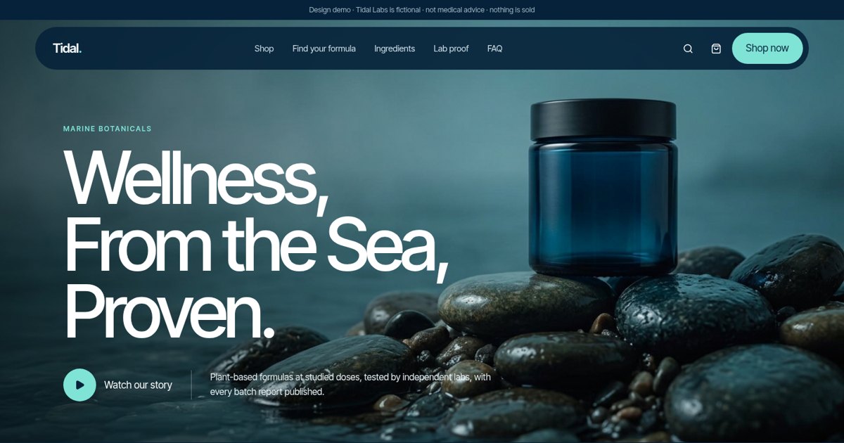
One ocean palette, one photo mood and one product style repeated on every section.
Open the live demoBrand guidelines: your brand's rulebook
Brand guidelines keep everything consistent when other people (printers, staff, freelancers) start using your brand.
For a small business, guidelines don't need to be a 60-page book. One to five pages is plenty. Here's what I include:
- Logo versions and when to use each
- Minimum size and clear space around the logo
- Color codes for web (hex) and print (CMYK)
- Fonts, sizes and weights for headlines and text
- Photo and icon style with examples
- Tone of voice: three adjectives and sample lines
- Do's and don'ts: no stretching, recoloring or adding effects to the logo
Branding on your website
Your website is where your brand gets judged most often. It's also where most small brands fall apart.
A branded website uses your colors, fonts, photos and voice consistently, puts your promise in the main headline, and makes the main action obvious. It should feel like the same business as your van, your social profiles and your invoices.
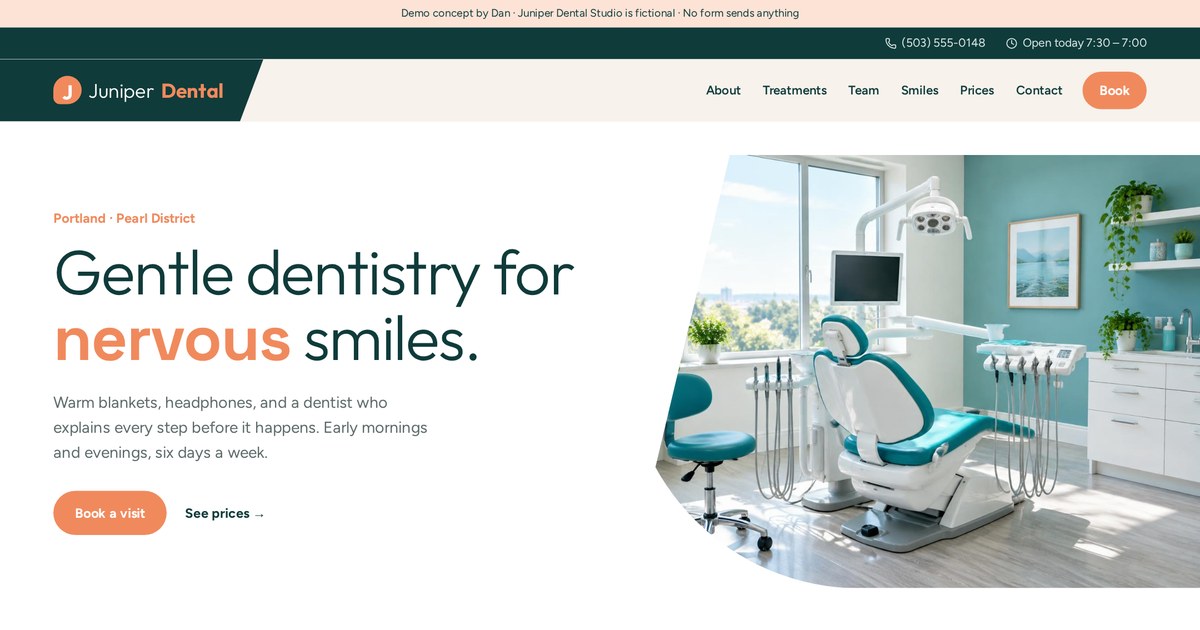
Calm colors, soft shapes and gentle copy aimed at nervous patients.
Open the live demo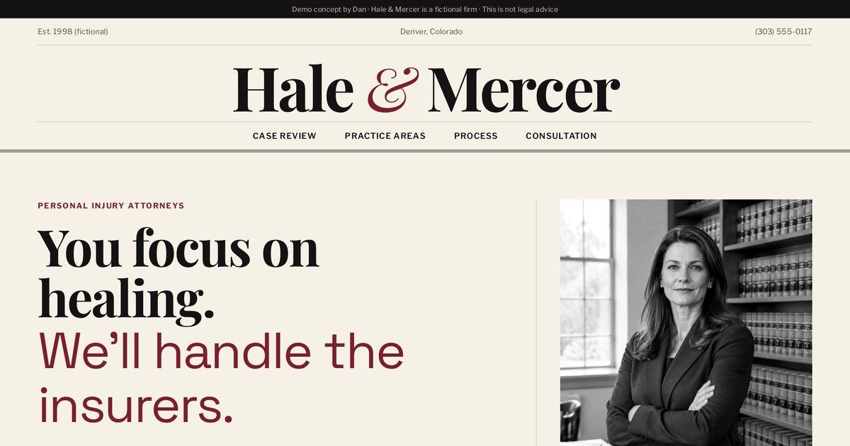
Serious serif type and restraint signal experience and discretion.
Open the live demo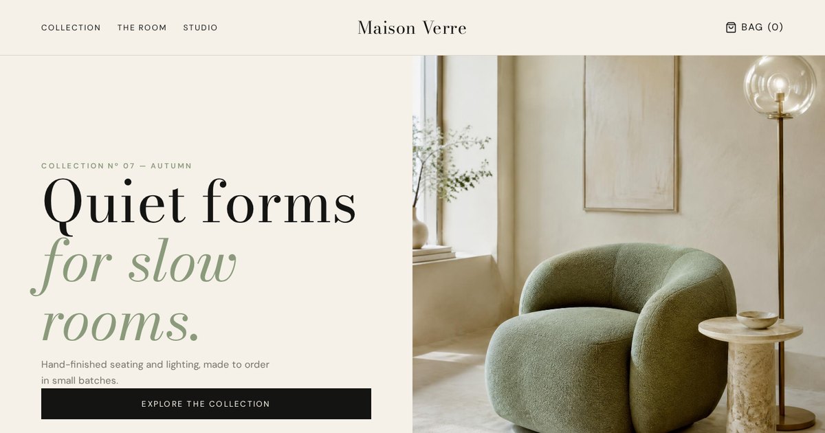
Lots of white space and editorial photography: the design itself says "premium".
Open the live demoBranding on landing pages and funnels
Landing pages strip things back to one goal, but they still need to look like you. Otherwise ad clicks feel like they landed on a stranger's page.
I keep the same logo, colors and voice from the ad through the landing page, the thank-you page and the follow-up emails. That consistency is called message match, and it makes people more comfortable taking the next step.
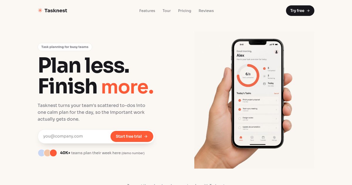
One bright accent color used only for the sign-up action.
Open the live demo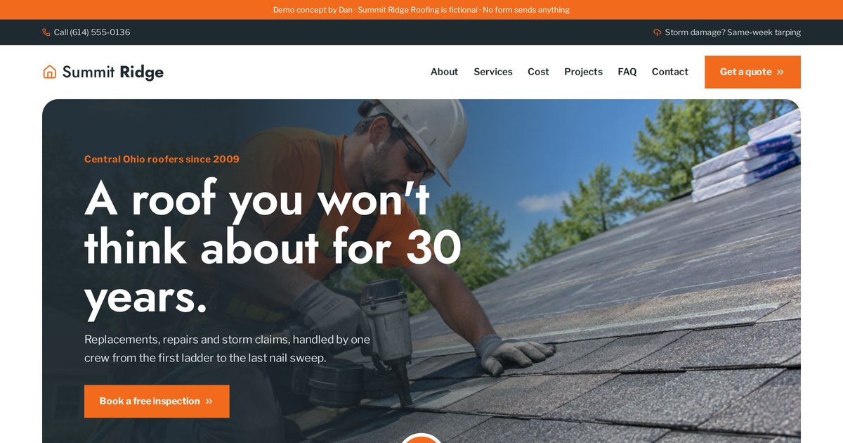
Every step, from ad to booking to follow-up, carries the same look and voice.
Open the live demoBranding for local businesses
Local trades and services win on trust and recognition in a small area. Branding works harder here than almost anywhere.
Your van, uniforms, yard signs, Google Business Profile, invoices and website should all match. When a neighbour sees your van, then finds you on Google, then lands on your site, recognition builds trust before they call.
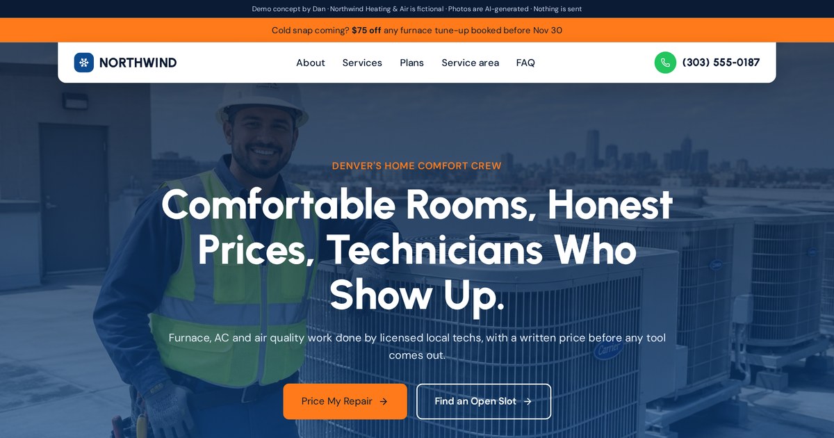
Arctic blue and warm orange: cold and heat, the whole service in two colors.
Open the live demo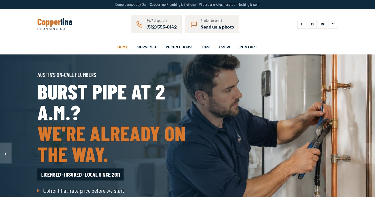
Navy and copper borrowed from the trade itself.
Open the live demo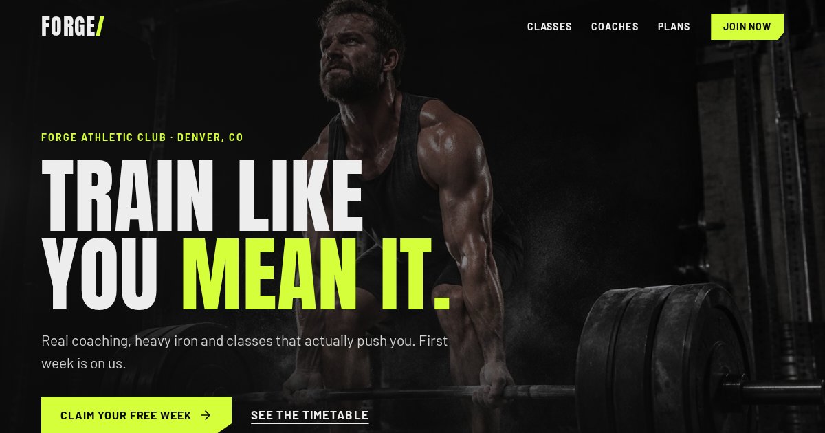
Heavy type and dark tones that feel like the gym floor.
Open the live demoRebranding: when and how to do it
Rebranding is a big decision. Sometimes it's needed; often a refresh is enough.
Signs you might need a rebrand
- Your business has moved upmarket but still looks budget
- You've changed services or audience
- Your look is easily confused with a competitor
- Your brand looks dated next to the alternatives
- You've merged, renamed or had reputation problems
| Refresh | Full rebrand | |
|---|---|---|
| What changes | Cleaned-up logo, colors, fonts | Strategy, name or identity |
| Risk | Low | Higher: you may lose recognition |
| Best when | Look is dated, meaning is fine | The business itself has changed |
Common branding mistakes I see
Most branding mistakes aren't about bad taste. They're about skipping decisions.
- Starting with the logo before deciding the audience and promise
- Copying the category leader so closely you blend in
- Using a different color or font in every post
- A logo too detailed to read at small sizes
- Only one logo file, usually a low-quality JPG
- Stock photos that could belong to any business
- A promise the service can't actually keep
- Fake reviews or made-up numbers: they destroy trust when spotted
DIY branding vs hiring a designer (and how I work)
You can absolutely start with DIY branding. Here's when it's fine and when hiring help pays off.
| DIY works when | Hire a designer when |
|---|---|
| You're testing an idea | The business is your main income |
| Budget is very tight | You're raising prices or going upmarket |
| You keep it very simple: name + one font + one color | You need a logo, website and funnel that match |
| Nobody depends on it yet | Competitors look much more professional |
How I work on branding
- A short call on your audience, promise and competitors
- A strategy sentence and voice adjectives we both agree on
- Logo concepts in different directions, shown as previews before anything final
- Colors, fonts and a mini style guide
- Logo files in all versions and formats
- The same identity carried into your website, landing pages and funnels
Want a logo and website that look like the same, very real business? Send me what you do and who it's for, and I'll suggest a direction.
Email meMy branding checklist
- Strategy sentence written: audience, result, difference, feeling
- 5 to 10 competitors reviewed side by side
- Positioning chosen and true
- Three voice adjectives with "not" pairs
- Name checked for domain, social handles and conflicts
- Logo type chosen before design starts
- Logo passes the small-size and one-color tests
- Full, compact and icon versions delivered
- Palette: main color, neutrals, one button accent
- Two fonts chosen and licensed
- Photo and icon style decided
- Short brand guidelines written
- Website, social, ads and print all updated to match
- Only real proof used
Branding terms in plain English
- Brand
- How people perceive and remember your business.
- Branding
- The work of shaping that perception.
- Brand identity
- The visible toolkit: logo, colors, fonts, imagery and voice.
- Brand guidelines
- Rules for using the identity consistently.
- Brand promise
- What customers can reliably expect from you.
- Brand strategy
- The plan for audience, positioning and promise.
- Brand voice
- How your brand sounds in words.
- Brand awareness
- How many people recognise your brand.
- Brand equity
- The value a brand adds beyond the product itself.
- Positioning
- The distinct place you hold compared to competitors.
- Target audience
- The specific people you want as customers.
- Value proposition
- Why a customer should choose you.
- Tagline
- A short memorable phrase that sums up the brand.
- Logo
- The mark that identifies your business.
- Wordmark
- A logo made of the styled business name.
- Lettermark
- A logo made of initials or one letter.
- Emblem
- A logo where the name sits inside a badge or shape.
- Mascot
- A character that represents the brand.
- Combination mark
- A symbol and name used together.
- Icon / brand mark
- A small symbol version of the logo.
- Favicon
- The tiny icon in the browser tab.
- Clear space
- Empty space kept around a logo.
- Vector file
- A logo file (SVG, AI, EPS, PDF) that scales without blurring.
- Raster file
- A pixel-based image like PNG or JPG.
- Hex code
- A color code for screens, like #2f5bff.
- CMYK
- Color values used for print.
- Pantone
- A standardised color matching system for print.
- Palette
- The set of colors a brand uses.
- Accent color
- A color reserved for buttons and highlights.
- Typography
- The fonts and how they're used.
- Serif
- Fonts with small strokes on letter ends.
- Sans-serif
- Fonts without those strokes.
- Mood board
- A collage that sets a visual direction.
- Style guide
- A short version of brand guidelines.
- Brand consistency
- Using the identity the same way everywhere.
- Message match
- Keeping ads and landing pages consistent in look and words.
- Rebrand
- Changing strategy, name or identity.
- Brand refresh
- Updating the look without changing the meaning.
- Trademark
- A legal protection for a name or logo.
- Personal brand
- A brand built around one person.
Frequently asked questions
What is branding in simple words?
Branding is shaping how people recognise and feel about your business through your name, logo, colors, words and the promise you keep.
Is branding just a logo?
No. The logo is one piece. Branding also covers your audience, promise, voice, colors, fonts, photos and how consistently you use them.
What are the main elements of branding?
Strategy (purpose, audience, promise), positioning, name, logo, colors, fonts, imagery, voice and guidelines.
Why is branding important for a small business?
It builds recognition and trust, helps you stand out from competitors, and makes it easier to charge fair prices.
What makes a good logo?
Simple, memorable, works in one color and at tiny sizes, fits your industry while standing out, and won't look dated quickly.
What is the difference between brand and branding?
Your brand is the perception people hold. Branding is the work you do to shape it.
How many brand colors should I have?
Usually one main color, one or two neutrals and one accent for buttons.
What files should I get with my logo?
Full, compact and icon versions in vector (SVG or PDF) and PNG, in color, black and white.
How long does branding take?
A small business logo and basic identity often takes a few weeks, depending on feedback rounds. A full strategy and rebrand takes longer.
Can I do my own branding?
Yes, especially early on. Keep it simple and consistent. Hire help when the business becomes your main income or you need everything to match.
When should I rebrand?
When your business, audience or price level has changed, or your look is dated or confused with competitors.
Do you design logos and branding?
Yes. I design logos and identities and carry them into websites, landing pages and funnels. Email dan@admusketeers.com or message me on WhatsApp.
Want a brand that looks as good as your business?
Let's build it.
I design logos and identities, then carry them into websites, landing pages and funnels so everything looks like the same real business. Tell me what you do and who it's for.